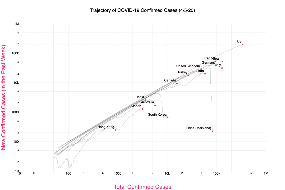
This interactive graph / animation charts the trajectory of global COVID-19 cases.
We plot the number of new confirmed cases in the past week, versus the total number of confirmed cases.
This way exponential growth is displayed as a straight line. site ![]() site
site ![]() github
github ![]()

Notice that most countries follow a similar straight line path, indicating that the growth rate is similar across countries. We're all in this together. expand ![]()
YOUTUBE 54XLXg4fYsc Published Mar 27, 2020.
This video is a collaboration with Aatish Bhatia about how to see the COVID-19 tipping point - we present a better way to graph COVID-19 coronavirus cases using a logarithmic scale in "phase space" - plotting the growth rate against the cumulative cases, rather than either of these against time.
The purpose of this notebook is to infer the rate at which confirmed cases of COVID-19 are growing (or were growing) in various countries. github ![]()
.
Tip: Use the Customize options to select regions that are in the news for their policy initiatives or are of interest to you. Then use the time slider to rock back and forth across inflection points to notice the sequence of inflections.
See also, Rt Covid-19. These are up-to-date values for Rt, a key measure of how fast the virus is growing. It’s the average number of people who become infected by an infectious person. If Rt is above 1.0, the virus will spread quickly. When Rt is below 1.0, the virus will stop spreading. site ![]() post
post ![]()

.
These are up-to-date values for Rt, a key measure of how fast the virus is growing. site ![]()
Exploring COVID-19 Data. site ![]()